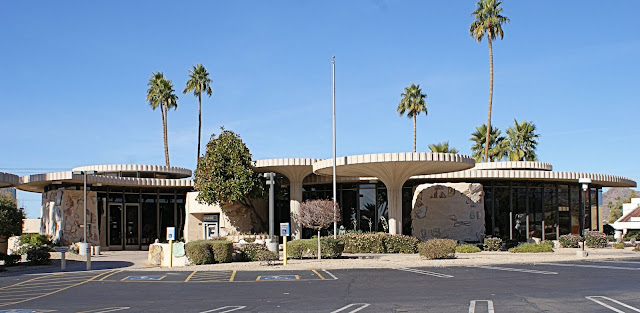
This is a bank building located at the corner of 44th Street and Camelback Road. It was built in 1967 for a branch of the Valley National Bank, a predecessor to Chase Bank who now occupies the building. Walter Bimson, then president of Valley National Bank, selected this design by Frank Henry of the Weaver & Drover firm from among five competing submittals. Bimson wanted to create a “modern building of timeless beauty as his gift to the city.” The building has definitely stood the test of time. It won the AIA Arizona Twenty-Five-Year Award, proving to be one of Arizona’s most distinguished and beloved midcentury buildings.
I work across the street from this wonderful building so I get to see it almost every day. Tomorrow I’ll show you more pictures from this property
The information for this building comes from a book entitled Midcentury Marvels, Commercial Architecture of Phoenix 1945 – 1975. The book was published in 2010 by the City of Phoenix Historic Preservation Office and Ryden Architects, Inc. It’s a gorgeous book that I purchased immediately after it was published. It contains wonderful photos and lots of information about some of the most distinguished buildings in the city.


16 comments:
It certainly has the 60s feel to it.
You really did your research on this one! That is one of the attractions of your site...you don't keep us guessing but always give us the facts!
It is indeed attractive, though it might take some time to get used to the unusual round umbrella towers. Most commercial architecture of the 1960s was disastrous and is quickly being razed.
This indeed is marvelous! Awesome captures!!
Greetings from Pixellicious Photos
I would love to take a look at your book the next time we are over to your place.
very interesting architecture
Looks like it could be out of the Jetsons' cartoon. It is an attractive building.
Interesting architecture. Are the circles for shade?
The tall palms and blue sky are a lovely backdrop for this building. Great shot.
I used to do my banking at that building. I remember it well.
I love it - glad that it survived intact. There was a hospital built here around the same time with umbrella-like structures like that and they have been removed and have been replaced with an ugly overhanging awning!
Interesting piece of history and nice old midcentury modern building. This one looks to be well maintained others in same error don't fair so well and just appear old and run down.
I have always liked the design. Never been in it though.
It appears as if several space ships are hovering close to the ground...but I think this is a superb structure! So unique and attractive!
Loved the bank series, Sharon.
Interesting enough Weaver and Drover who is now DWL Architects + Planners, also designed the City of Glendale Foothills Branch Library that houses the Chihuly installation! :)
Post a Comment